branding
branding
new brand identity
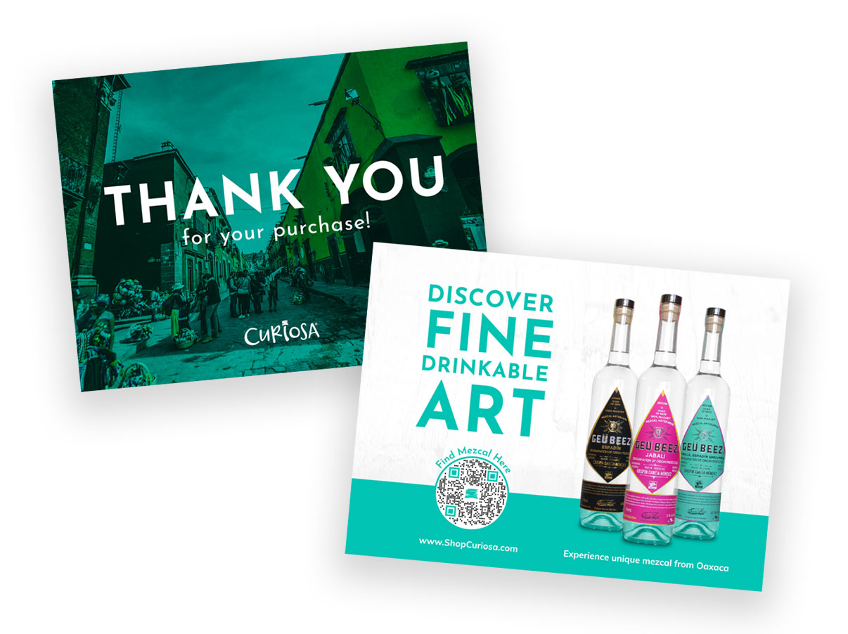
Project: Paulina Tamayo, owner of Tamayo Brands, enjoys discovering unique mezcal while traveling through Oaxaca, Mexico. She wants to import these delicious finds and sell them in the United States.
Goal: To create a brand that enriches others with stories about the history and cultural significance of mezcal. She wants her customers to enjoy these hand-selected works of art and share the stories with others.
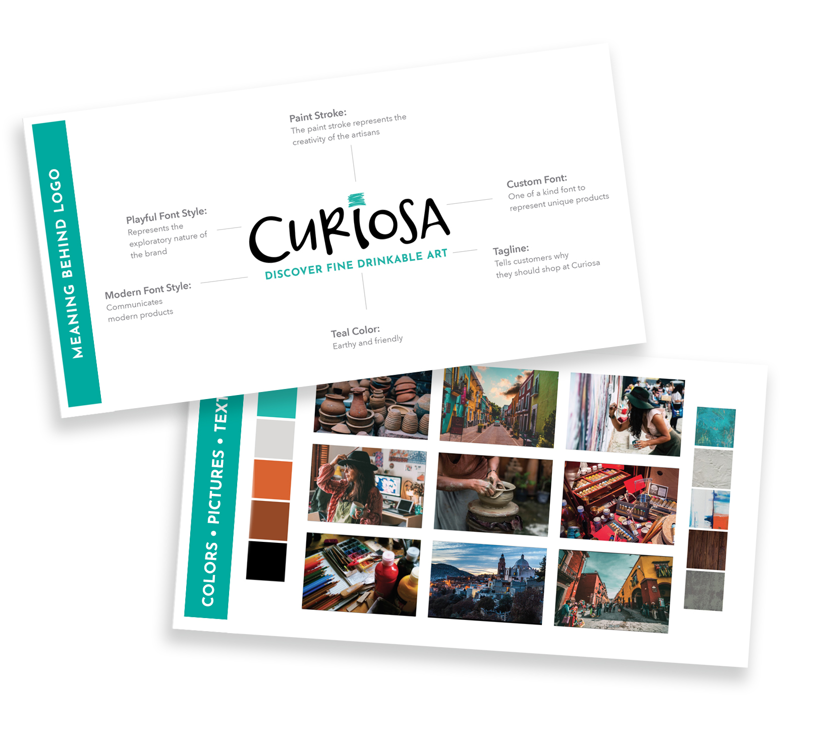
Solution: Developed a name that communicated Hispanic heritage, discovery, artistry, and her inquisitive personality. Designed a playful, custom font shows the exploratory nature of the brand while the paint stroke represents the creativity of the artists.
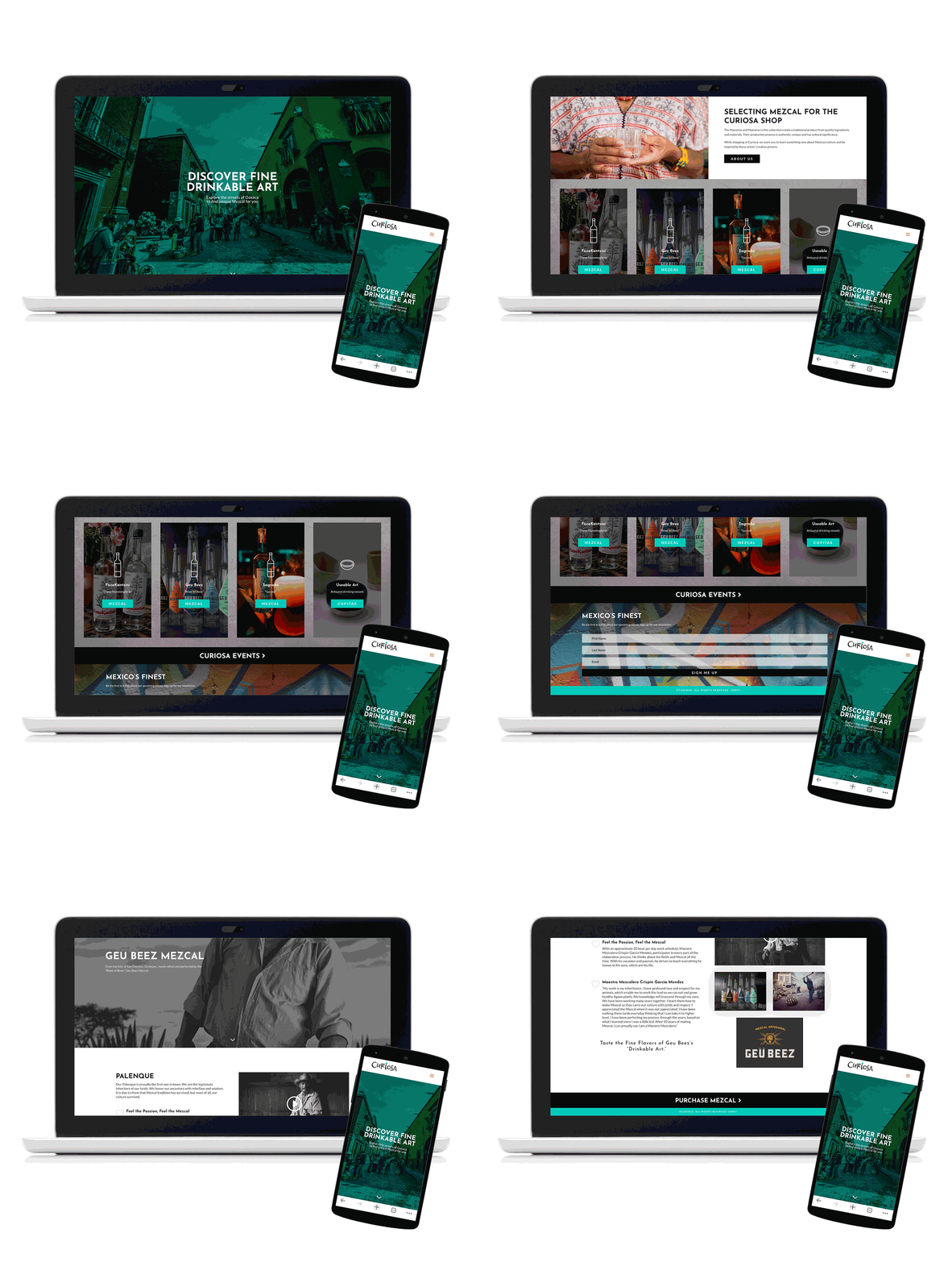
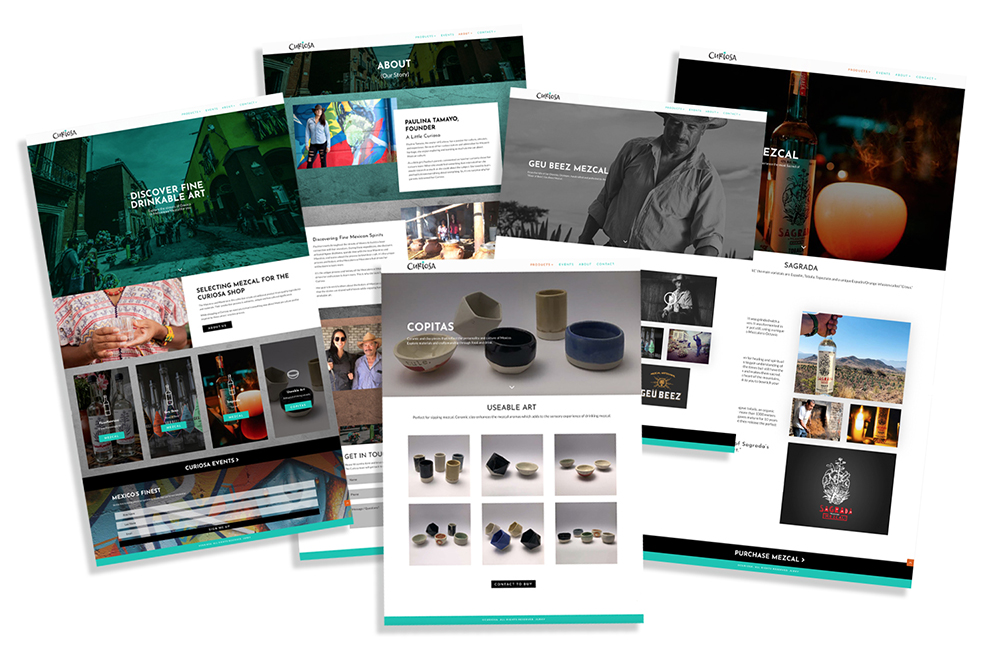
Deliverables: New Brand Name • Brand Logo (Color, B/W, One Color; Variety of formats: .eps, .png, .jpg, .pdf) • Style Guide (brand story, brand logo, logo meaning, colors, fonts, logo format uses, images, textures) • Business Cards • Website
Jurky has been fundamental to the success of my small woman-owned and operated business. Her insight and professionalism have helped guide my customer base in the best way possible. I consider the tools she has provided to me as the best investment I’ve made. I will keep using Jurky, and her amazing team, because they add the most value to my business mostly in terms of branding and marketing. Plus she’s very fun and has the most creative ideas! I recommend her 1000%.
branding
full rebrand
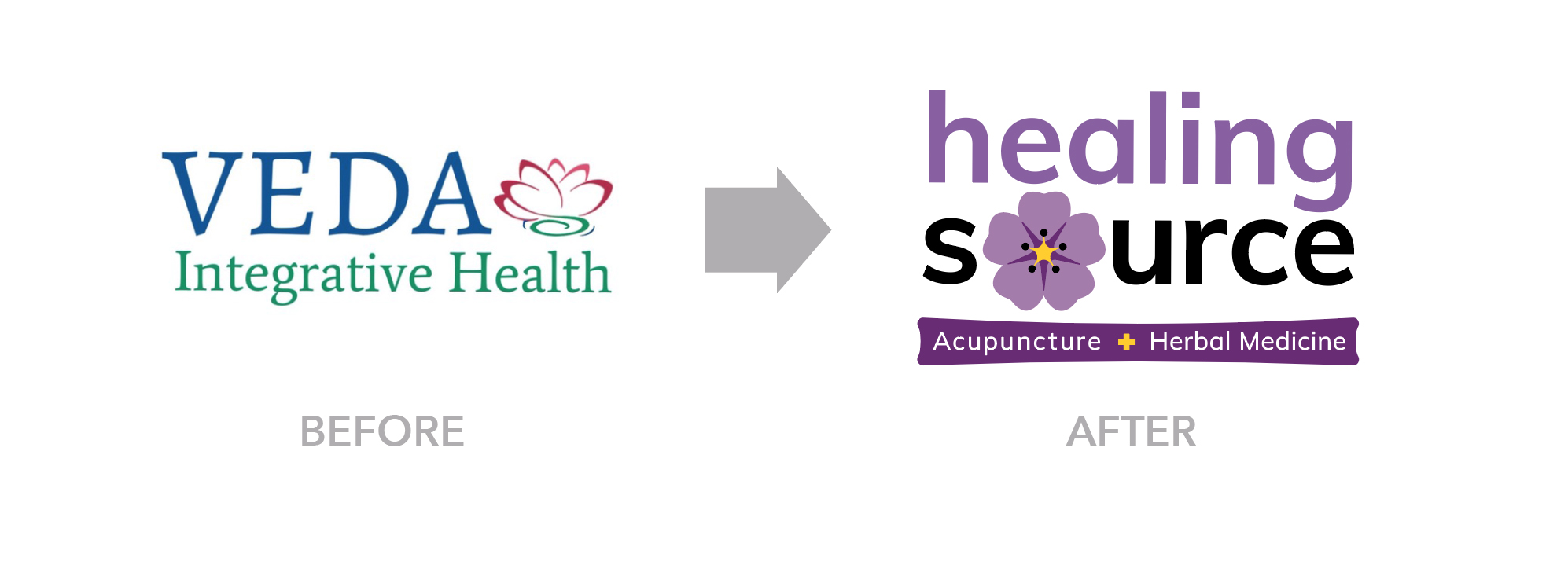
Project: The owner of an acupuncture and wellness clinic moved to Colorado and discovered that a practice with a similar name existed in a nearby town. She was never thrilled about her business name (Veda Integrative Health) or brand and used the move as an opportunity to rebrand.
Problems with existing name:
• Nobody knows what “Veda” means
• “Integrative” is too wordy and people spell it wrong (i.e. Integrated)
• Doesn’t say what the business does
• It takes too much explanation for potential clients
Goal for future name:
• Tells customers what type of service is provided
• Can transition from acupuncture business into wellness center in the future
• Phrase that communicates an Eastern/Western practice
• Brand identity that appeals to men (35%), but mostly women (65%)
Solution: Developed a name that describes a wellness destination with a secondary name that communicates the type of business. This secondary name can be removed (or changed) at any point and the brand will still remain strong.
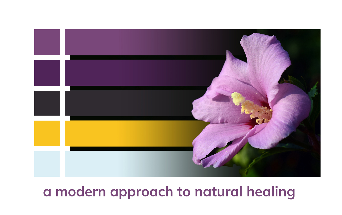
The tagline “A modern approach to natural healing” refers to the combination of an Eastern/Western medical practice.
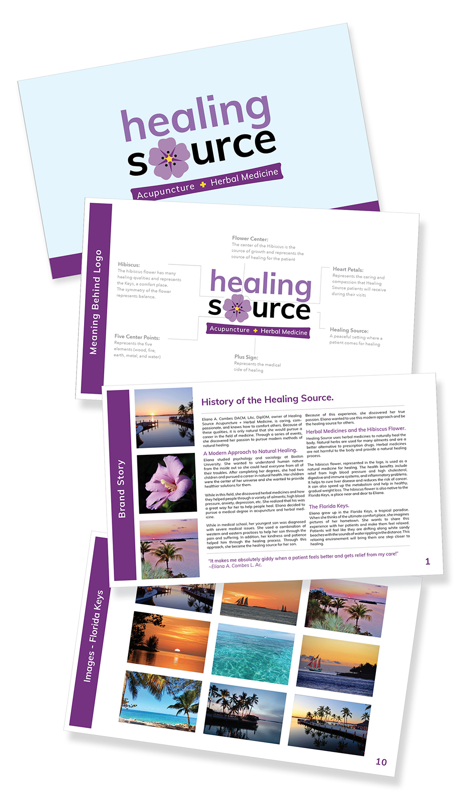
The hibiscus flower, represented in the logo, is used as a natural medicine for healing. It is also native to the Florida Keys, a place near and dear to the owner. Her office will be surrounded by images from this location so that her patients can enjoy a comfortable and relaxing experience.
branding
brand refresh
Project: The company name “Mozaro” doesn’t communicate a specific message to its potential customers. The overall brand needs a refresh due to inconsistent messaging and images.
Goal: Keep existing name “Mozaro”, but give it meaning.
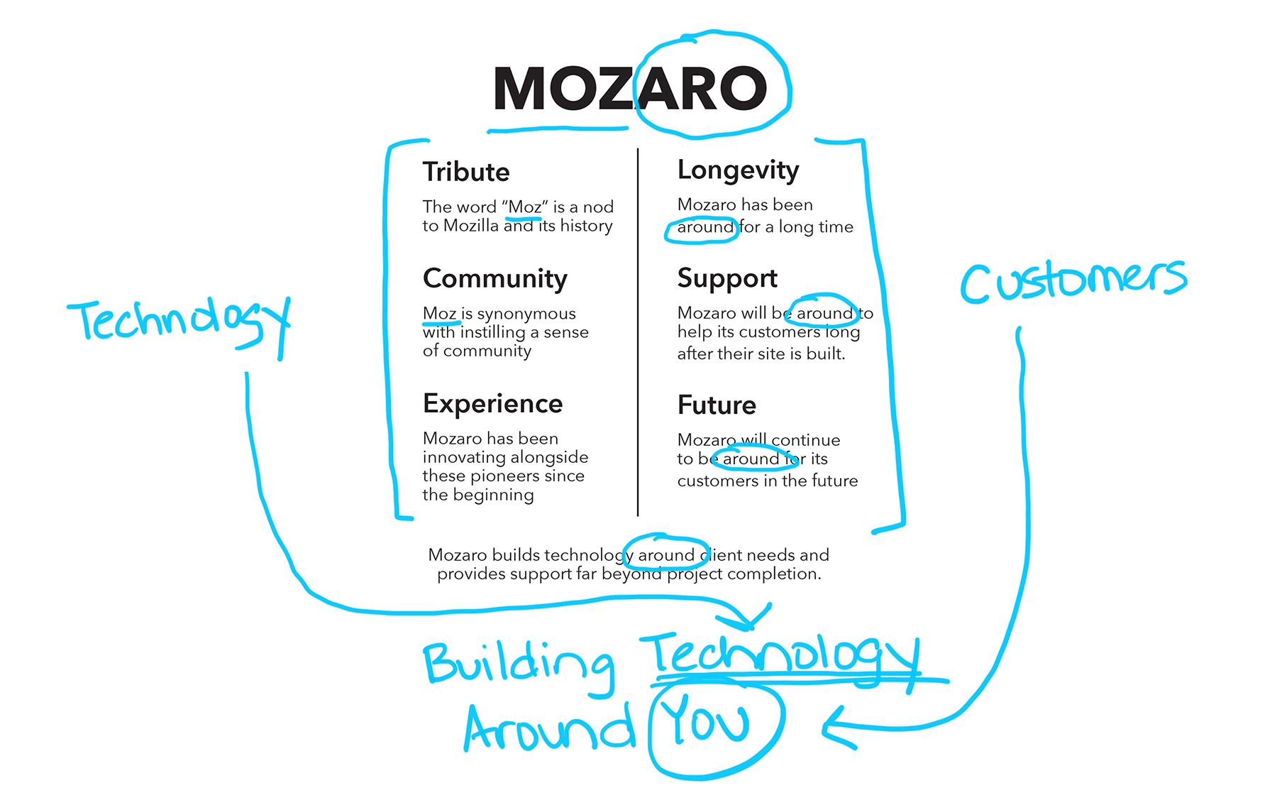
Solution: Researched the history of the existing name to understand its meaning and interviewed the owners to understand their purpose. After digging into the name, it was clear that “Moz” was a tribute to Mozilla’s technology history. But what was “aro”?
Mozaro has always put its customer first and built products around their needs. It was only natural that the name had two meanings which merged to form one: Moz for its tribute to technology and aro refers to the way Mozaro wraps services around its customers. Moz + aro = Mozaro. From this, the tagline was conceived: Building Technology Around You.
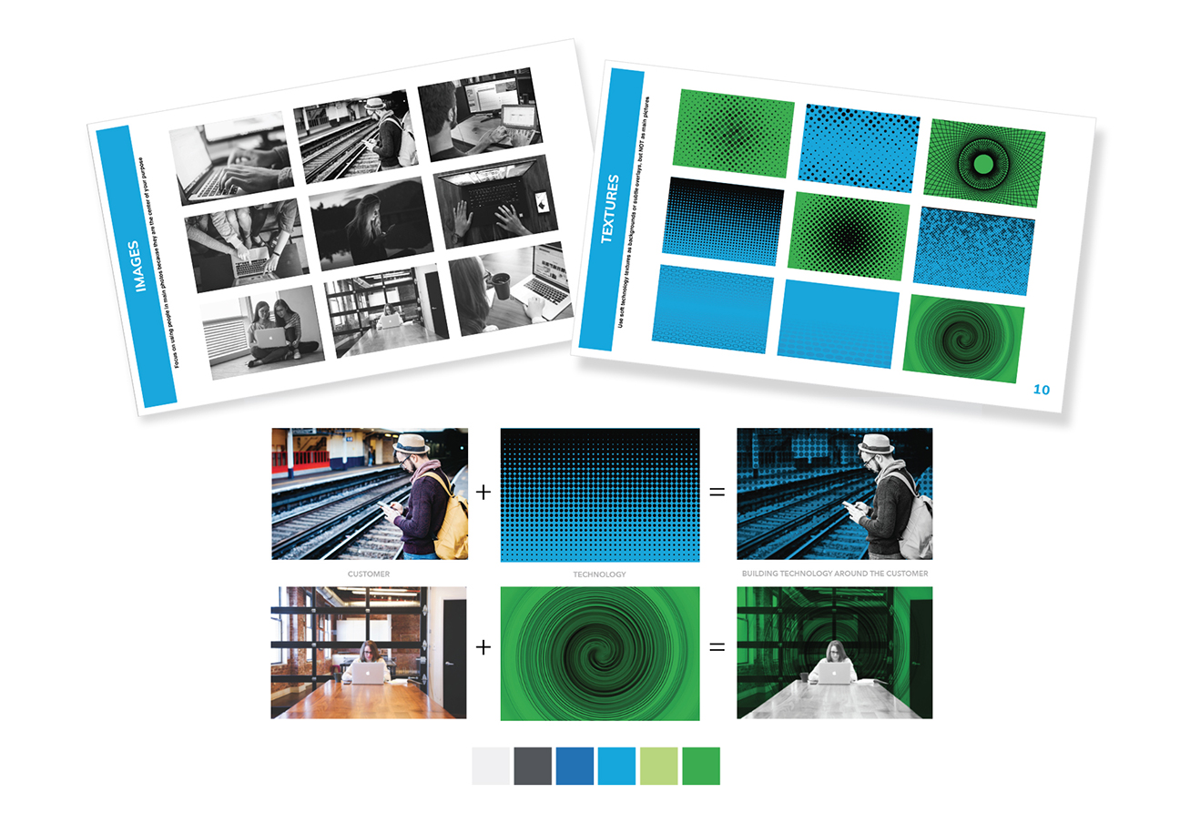
Images: Focused on using people in photos because they are the center of the company’s purpose. Textures and color and used in the background to reference technology. Together, the image and texture communicate technology built around the customer.
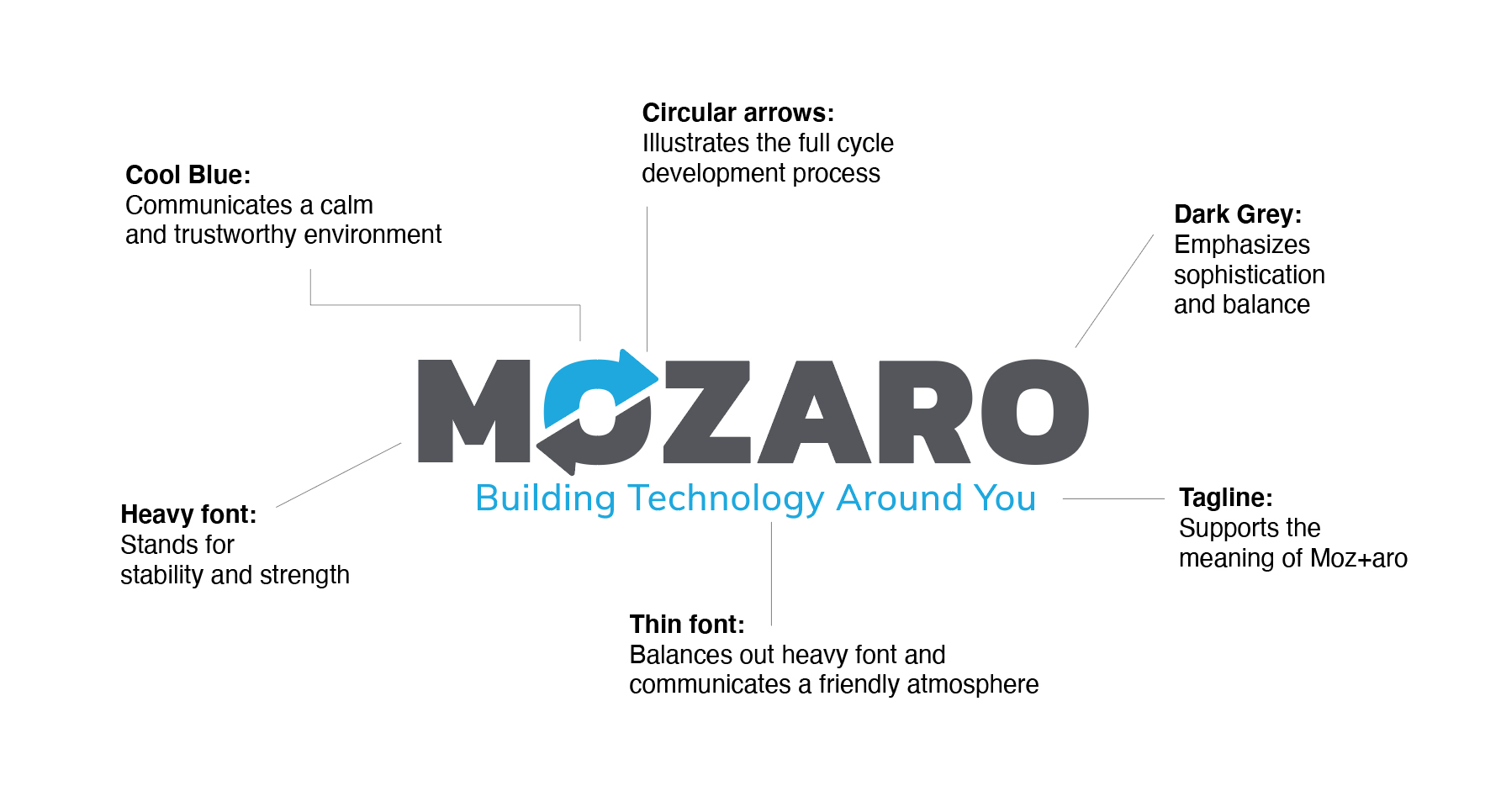
Jurky worked with our company to help us create a clearer, consistent messaging for our brand. She created a new logo, tag line, style guide and overall voice of our brand that far exceeded our expectations. The project was on time and on budget.
branding
logo designs



Jurky is absolutely AMAZING! Her presentation and thought process about what your company’s vision is along with what your competitors are doing was truly appreciated. She did extensive research and has such great ideas on how to BRAND your business. She’s one of the best in the business!
