package design
package design
brand extension
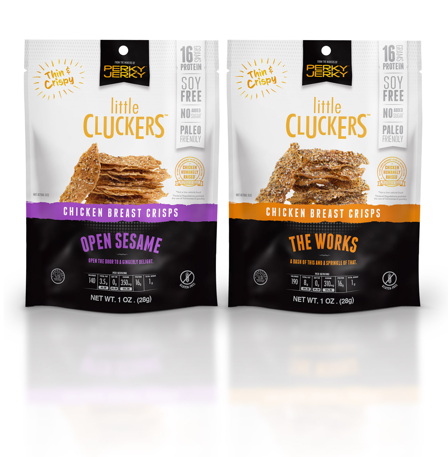
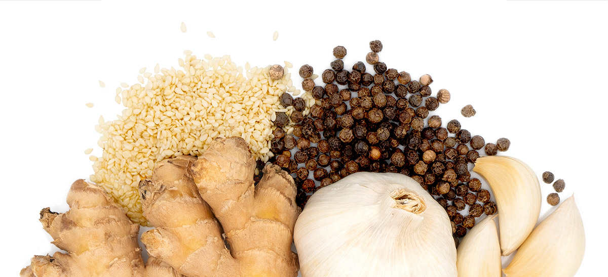
Project: New product line for Perky Jerky and first of its kind to market. Items needed: product name, flavor names, one-liner descriptions, full flavor descriptions, photography, and package design.
Goal: Create new packaging that stands out on its own but still maintains some of the current brand’s elements; make it the same, but different.
Solution: Developed hilarious (and memorable) name that fits the brand’s quirky sense of humor: Little Cluckers (because they are tiny chicken crisps). Each flavor name, one-liner, and description follows a similar comedic theme to the brand’s main product line.
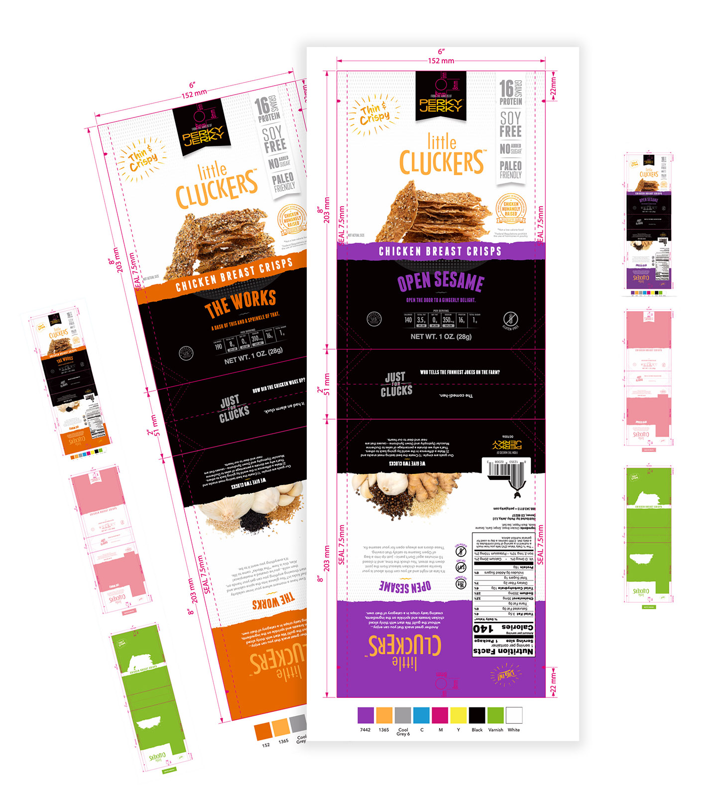
Other elements were added to the design for entertainment value such as a barn shaped UPC code and chicken jokes on the bottom of the package. The result is classy with a twist of humor.
package design
package refresh
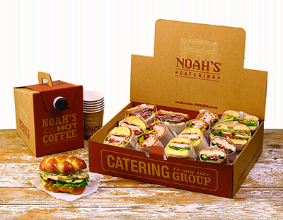
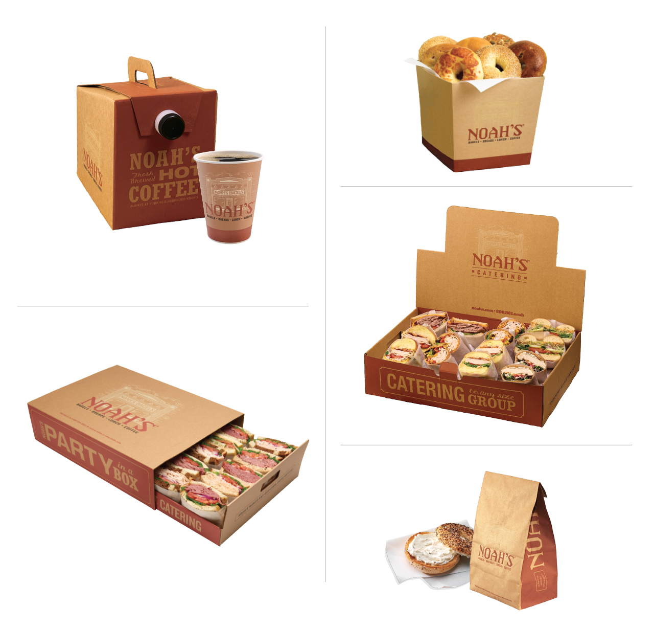
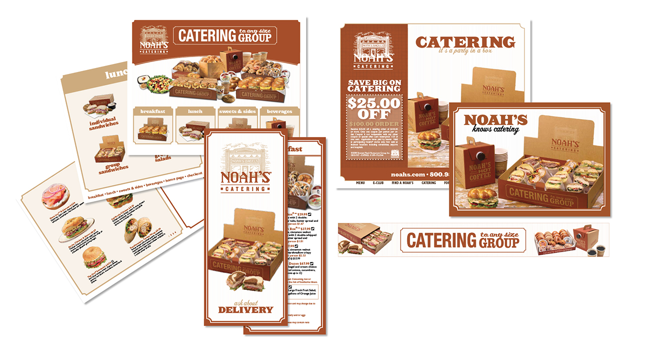
Project: Catering packaging and marketing materials are inconsistent and need a makeover.
Goal: Create a design that fits the brand but stands out from the standard take-out packaging.
Solution: Chose soothing colors that reflected Noah’s brand and placed them on kraft material to communicate a wholesome, healthy meal.
Created a cohesive design for all catering materials based on new packaging (banners, brochures, postcards, emails, flyers packaging, website, etc.). Developed style guide for future marketing materials to maintain consistency.
package design
new product
